Shopify Conversion Rate Optimization.
Transforming Your Homepage for Maximum Impact
In the world of ecommerce, optimizing your Shopify store’s conversion rate is paramount to driving sales and maximizing your business’s growth potential. Your homepage serves as a crucial gateway to engaging and converting visitors into customers. By focusing on key elements above the fold—the visible portion without scrolling—you can make a lasting impression and entice users to explore further. In this article, we will explore essential tips for optimizing your Shopify homepage to improve conversion rates and boost your online business.
CRO Shopify Store Homepage Best Practices
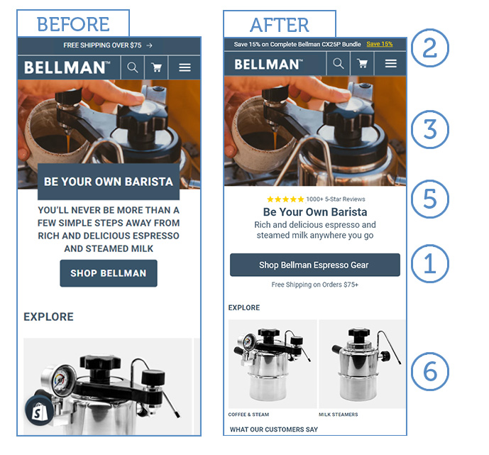
We’ll kick off by exploring an example, and then we’ll dive into the best practices for optimizing the conversion rate of your Shopify homepage. Let’s begin with a practical illustration and then proceed to the strategies that can elevate your homepage’s performance.
1. Clear and Descriptive CTAs Above the Fold
Place clear and descriptive calls-to-action (CTAs) prominently above the fold. For example, „Shop Mattresses,” „Shop Standing Desks,” or „Shop Brewing Equipment.” These CTAs provide immediate guidance, helping visitors navigate directly to the products they are interested in.
2. Benefit-Oriented Value Proposition Above the Fold
Capture visitors’ attention with a benefit-oriented value proposition in the top bar. For instance, „Free Shipping for Orders Over $100. Shop Now.” This concise and compelling message communicates a clear benefit to the customer and encourages them to take action.
3. Avoid Full Page Interstitials
Eliminate the use of full page interstitials that interrupt the user experience. Instead, focus on delivering a seamless and uninterrupted browsing experience that encourages visitors to explore your offerings without unnecessary disruptions.
4. Remove Automatic Carousels
Carousels or sliders that automatically cycle through images can often distract visitors and reduce conversion rates. Opt for static, visually appealing imagery that highlights your products or key messages, allowing visitors to engage with the content at their own pace.
5. Display Social Proof
Instill trust and credibility by displaying social proof elements. Showcase the number of happy customers, such as „1000+ Happy Customers,” and emphasize positive reviews, such as „80,000+ 5-Star Reviews.” This social proof reassures visitors of the quality and reliability of your products or services.
6. Highlight Top Categories on the Homepage
Display your top categories prominently on the homepage. By showcasing popular product categories, you make it easier for visitors to find what they’re looking for and quickly navigate to their desired sections.
7. Opt for Legible Font Sizes (16px+)
Ensure your font sizes are legible and easily readable, particularly on mobile devices. Use a minimum font size of 16 pixels to enhance readability and accessibility, allowing visitors to absorb your messaging without any strain or confusion.
Conclusion:
Optimizing your Shopify homepage is a fundamental step in increasing your conversion rate and driving business growth. By implementing these key tips, including clear and descriptive CTAs, benefit-oriented value propositions, eliminating disruptive interstitials, showcasing social proof, displaying top categories, and using legible font sizes, you create a user-friendly and conversion-focused homepage. Regularly monitor and analyze performance data, making necessary adjustments to further refine your strategy. Remember, a well-optimized homepage sets the stage for an exceptional user experience, fostering trust, engagement, and ultimately, higher conversion rates for your Shopify store.

